Happy 6th birthday!
FolioHD launched 6 years ago this month, and the portfolio space has changed a lot since then. In 2010, there were only a handful of portfolio sites. I thought it could be done better, and that’s how FolioHD was born.
But I never imagined we would be the inspiration to so many copycats. Some have come and gone, and some are doing quite well. We’ve been copied on everything from designs, marketing sites, logos, upload limits, feature sets, and verbiage. But while I’d like to be mad about someone copying us, I think I’ll stick with just being flattered. And in honor of our 6th birthday, I figured I’d share a few examples of the “flattery”.
Example #1: Portfolio Site Designs

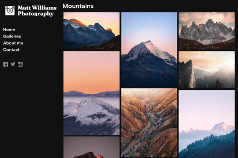
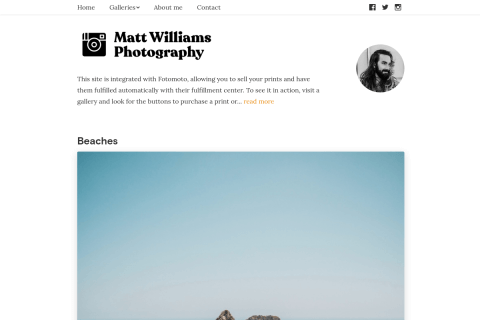
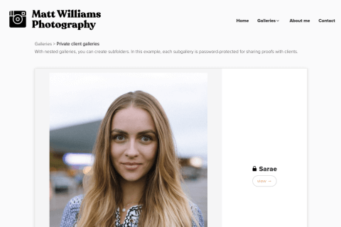
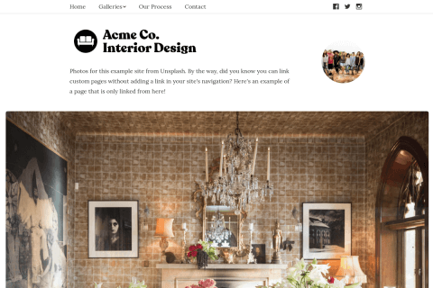
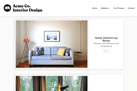
Example of a FolioHD gallery page

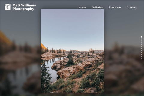
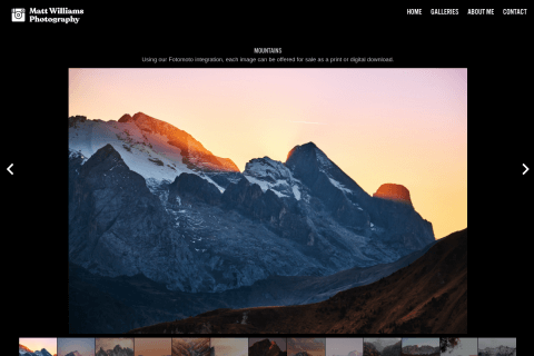
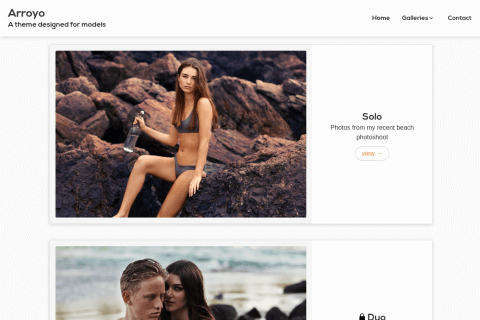
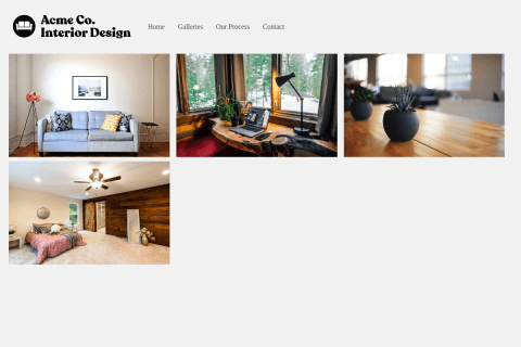
Example of another site's gallery page
Strikingly similar, aren’t they? In fact, the only real difference is the addition of visible tags, which seem to have been thrown in there after-the-fact like they didn’t have any design inspiration for it. (Maybe because we don’t show tags?) Digging into the code, it’s also ironic just how similarly the code is formatted. Everyone’s style of writing code is unique and somewhat identifiable. When I look at theirs, I see my own code.
If you’re still wondering if this is just all a big coincidence, you should also know that this competitor calls their version of this theme, the “Folio” theme… Yeah, I’m sure completely unrelated to FolioHD.
Example #2: Logo “inspiration”

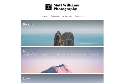
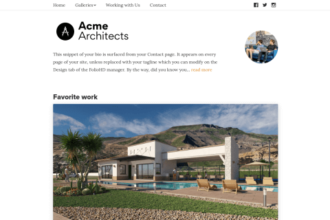
An old version of our logo

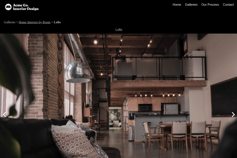
Another portfolio site's logo
You could also say this one is a coincidence, but you should know that this also copied FolioHD’s main theme. (This competitor is no longer around, so I can’t grab a screenshot.)
Example #3: “Make it like FolioHD, but put our logo on it.”

FolioHD website vs. another website

Our Facebook cover image vs. theirs

I mean, this is getting ridiculous at this point. (I should point out that the background image used in both of these screenshots is a stock photo, freely available for anyone to use - original photo seen at right.) The problem I have is not that they used the photo. It’s the combination of the following:
- They are a portfolio site and they used the same image.
- They morphed a screenshot of their site into the computer’s screen. There was deliberate effort to copy what we had done. This is enough to show that they jacked the idea from us.
What’s the problem with these examples? It’s not that I don’t like competition (because I do). FolioHD certainly wasn’t the first online portfolio site. We just had ideas to make it better.
The problem with these sites is that they aren’t trying to do things better; they’re just copying somebody else’s work. (I should point out that most of the other parts of these competitive apps are far worst-designed in the parts that they didn’t copy from us.)
Competition is important because it makes the world a better place. Most of what competition is, is building off of someone else’s idea, putting your own spin on it, and making something marginally better. But that’s not what these sites did.
If you’re going to enter a competitive space, be prepared to bring something to the table. Don’t just copy a competitor’s site, because what’s the fun in that? (If you like my work that much, just hire me!)
Well, here’s to another 6 years, and many, many more future imitations!
